Page 1 of 5
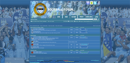
New Default Theme

Posted:
Wed Jun 19, 2013 8:28 pmby MaineRoadMemories
Re: New Default Theme
Posted:
Wed Jun 19, 2013 8:30 pmby PeterParker
Almost had a heart attack when i refreshed the page.
Re: New Default Theme
Posted:
Wed Jun 19, 2013 8:31 pmby Alex Sapphire
NICE
I think
Re: New Default Theme
Posted:
Wed Jun 19, 2013 8:31 pmby BlueinBosnia
There's no way you can change the transition speed between the images at the top? They go a bit too fast for my liking. It's disturbing.
Otherwise, really like the theme!
Re: New Default Theme
Posted:
Wed Jun 19, 2013 8:43 pmby twosips
Does it hurt anyone else's eyes to look at? It's really....stark. Just an odd combination of colours. When it refreshes it almost *Blinks* and it reminds me of those Japanese Seizure bots from the simpsons episode.
Re: New Default Theme
Posted:
Wed Jun 19, 2013 8:43 pmby PeterParker
BlueinBosnia wrote:There's no way you can change the transition speed between the images at the top? They go a bit too fast for my liking. It's disturbing.
Otherwise, really like the theme!
This.
And maybe add the Dickov moment?
Re: New Default Theme
Posted:
Wed Jun 19, 2013 8:45 pmby BlueinBosnia
twosips wrote:When it refreshes it almost *Blinks* and it reminds me of those Japanese Seizure bots from the simpsons episode.
This, too.
Re: New Default Theme
Posted:
Wed Jun 19, 2013 8:46 pmby Nigels Tackle
don't like it
Re: New Default Theme
Posted:
Wed Jun 19, 2013 8:47 pmby Alex Sapphire
RTFM you silly buggers:
and I quote:
If you don't like it then you know what to do!
Go to your User Control Panel
Then click on Board Preferences
Scroll down to Board Style
Select from a choice of 4 styles...
you need your arses wiping too?
I'm not sure I like it either
Re: New Default Theme
Posted:
Wed Jun 19, 2013 8:48 pmby HeyMark
I think it looks class. Well done mate
Re: New Default Theme
Posted:
Wed Jun 19, 2013 8:55 pmby BlueinBosnia
Alex Sapphire wrote:RTFM you silly buggers:
and I quote:
If you don't like it then you know what to do!
Go to your User Control Panel
Then click on Board Preferences
Scroll down to Board Style
Select from a choice of 4 styles...
you need your arses wiping too?
I'm not sure I like it either
Some things get tweaked to improve them. If this is the final version, I'll probably see if it grows on me for 2-3 weeks. If not, I'll revert. If there are a few tiny things that can be changed easily to make more people appreciate the hard work that MRM has put in, then I'm sure he won't mind the user feedback.
Re: New Default Theme
Posted:
Wed Jun 19, 2013 8:57 pmby Dameerto
I wondered what was going on at first - I like it, nice contrast - I'm not squinting at the sig text now.
Re: New Default Theme
Posted:
Wed Jun 19, 2013 8:59 pmby Alex Sapphire
BlueinBosnia wrote:Alex Sapphire wrote:RTFM you silly buggers:
and I quote:
If you don't like it then you know what to do!
Go to your User Control Panel
Then click on Board Preferences
Scroll down to Board Style
Select from a choice of 4 styles...
you need your arses wiping too?
I'm not sure I like it either
Some things get tweaked to improve them. If this is the final version, I'll probably see if it grows on me for 2-3 weeks. If not, I'll revert. If there are a few tiny things that can be changed easily to make more people appreciate the hard work that MRM has put in, then I'm sure he won't mind the user feedback.
well said
Re: New Default Theme
Posted:
Wed Jun 19, 2013 9:00 pmby Peter Doherty (AGAIG)
Any chance of getting rid of that 'share' shit at the right hand side. I'd stick with it then....
Re: New Default Theme
Posted:
Wed Jun 19, 2013 9:05 pmby Beefymcfc
What's that 'Share' thing on the page, how do I get rid?
I'm not sure about the secondary background colour or the new quote screen with the large quote pics, it makes it hard to read.
I do like the white on dark though, makes it easy to read.
Re: New Default Theme
Posted:
Wed Jun 19, 2013 9:13 pmby Dameerto
The regular blue poster names can be a little difficult to make out at times, but it's not a big issue for me (it might be just my screen for all I know). If it's a general problem rather than specific to me, the dark blue used in Beefy's sig (one post up from this) gives a decent contrast.
Re: New Default Theme
Posted:
Wed Jun 19, 2013 9:14 pmby halnone
There need to be something to further differentiate the posts. At a quick glance, all of the text on the page appear to part of the same post.
other than that I actually really like this theme.
Re: New Default Theme
Posted:
Wed Jun 19, 2013 9:17 pmby Dameerto
halnone wrote:There need to be something to further differentiate the posts. At a quick glance, all of the text on the page appear to part of the same post.
other than that I actually really like this theme.
Posts are separated by a small gap on my screen, strange that you can't see it.
Re: New Default Theme
Posted:
Wed Jun 19, 2013 9:22 pmby Peter Doherty (AGAIG)
Dameerto wrote:halnone wrote:There need to be something to further differentiate the posts. At a quick glance, all of the text on the page appear to part of the same post.
other than that I actually really like this theme.
Posts are separated by a small gap on my screen, strange that you can't see it.
What, is he in your house?
Re: New Default Theme
Posted:
Wed Jun 19, 2013 9:23 pmby johnny crossan
I don't welcome change at my age